Making expeditions more accessible, removing the hassle of planning.

Client
Echio Adventure
Deliverables
UI Design - Website rebrand/ Expedition Planner
Brand Guide
Logo - Echio
Animation
Social Media Management
The Challenge
The brand was giving off mixed signals in their messaging. Making it hard for potential investors/ target market to take their vision seriously
The Solution
Give their voice an encouraging yet prideful tone. Champion the niche community they love so much, but feel welcoming to newcomers sensing the urge to step out of social norms.
Logo Progress
Complete rebrand, focusing on the feeling of an adventure. A brand that thrives within the digital space and champions the achievements of the industry loud and proud.
The angle and shape of the flag resembles a flag similar to the one that represents the completion of expedition up mount everest.

New
Old
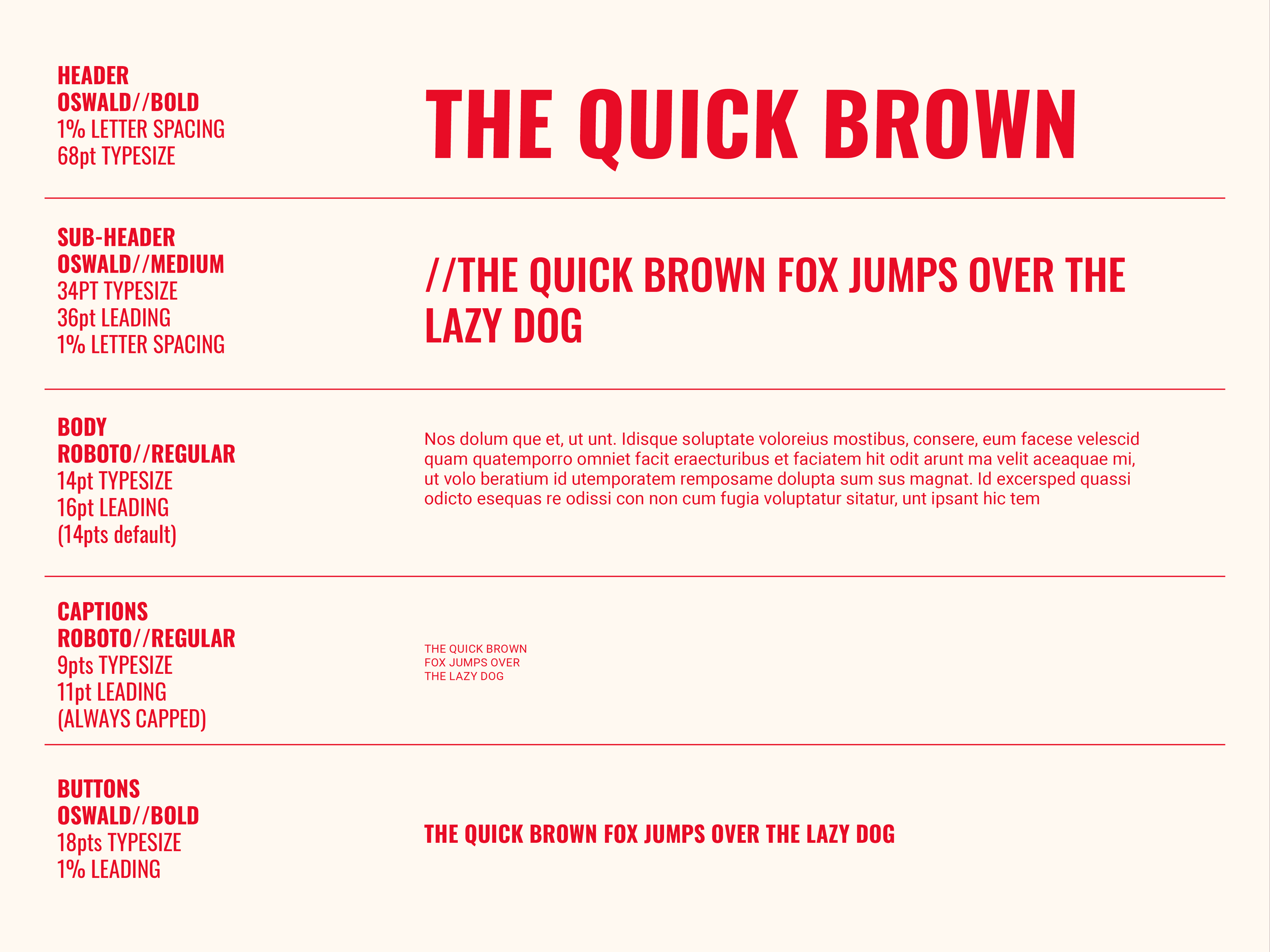
Brand guide
Conveyed the spirit of adventure through their new brand identity with a cohesive message and visual storytelling.
Reflecting the brand new voice to design a expedition planner that occupies all the needs of an adventure. Document storage, route planning, chat function, task managment section, zoom integration and role features so everyone is on the same page in the process.
All in one place.

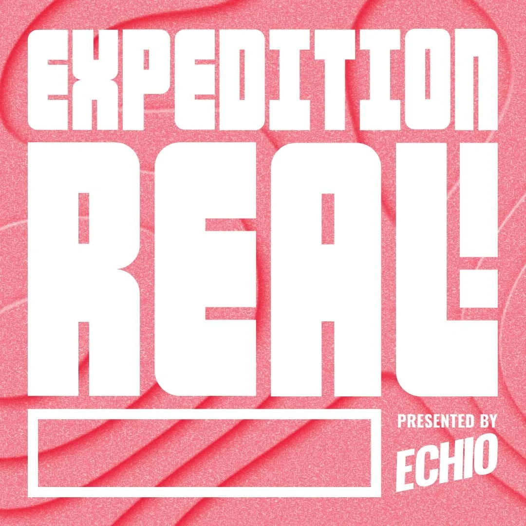
podcast
Branching of the ECHIO brand, the CEO wanted to promote the communities voices by releasing a podcast series that shared adventure stories and achievements as another way to make the niche more accessible.
As a side project I needed to create a new logo that acted seperate to the ECHIO logo but can harmonise with the mark on a podcast thumbnail on platforms like spotify. I was also tasked to experiment with motion graphic to animate in the background of the thumbnail. This was the main challenge as I had to learn to animate from scratch, but I adapted and persevered.
Leading the final topographic inspired motion graphic.
Website Rebrand
-
![]()
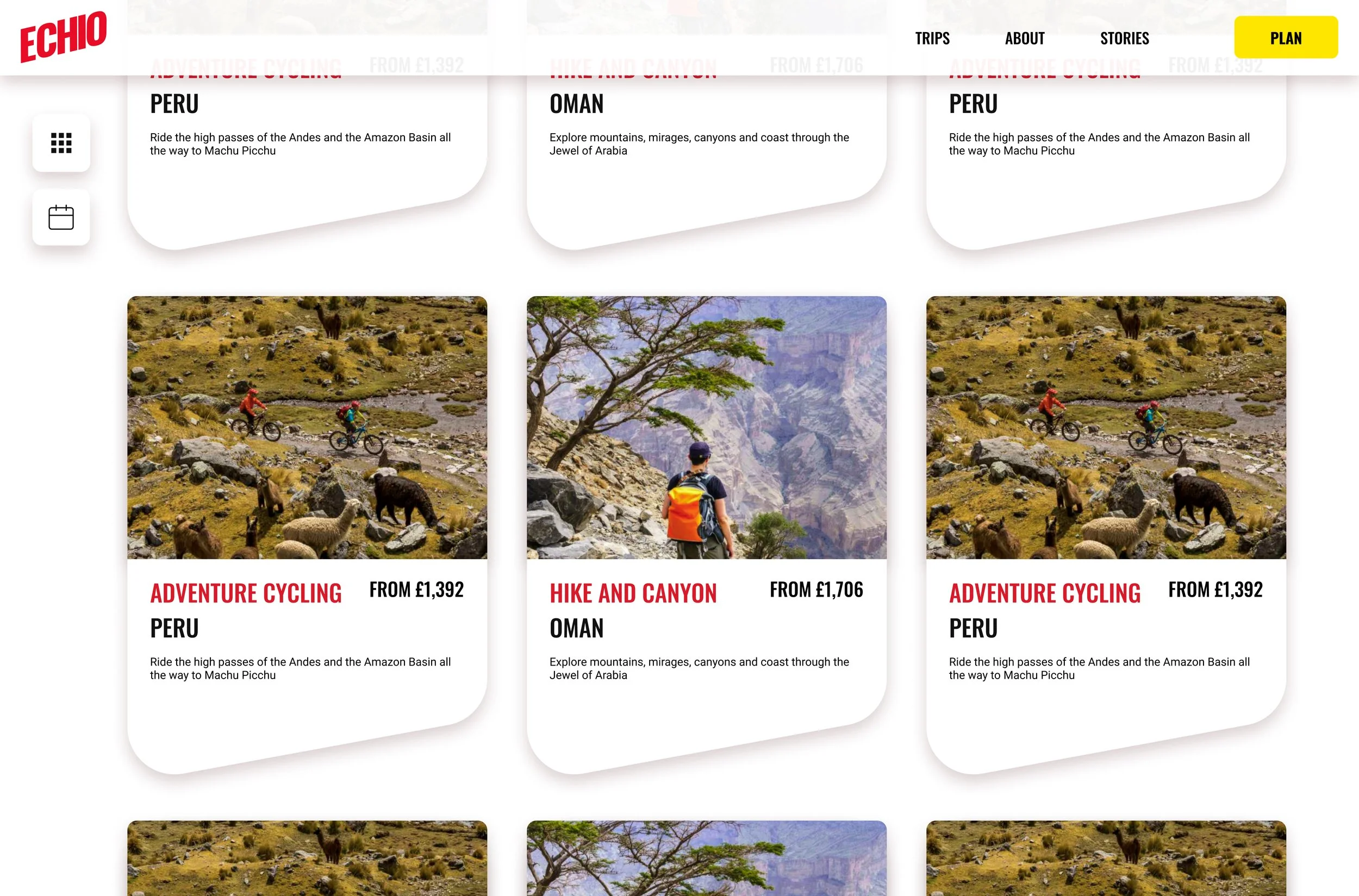
Trip Sale Homepage
-
![]()
Trip Cards
-
![]()
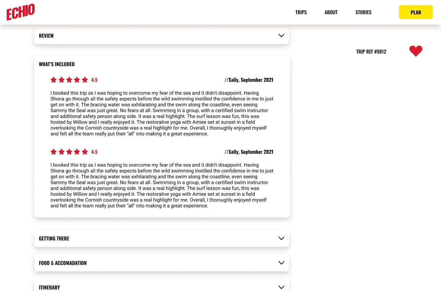
Customer Review
-
![]()
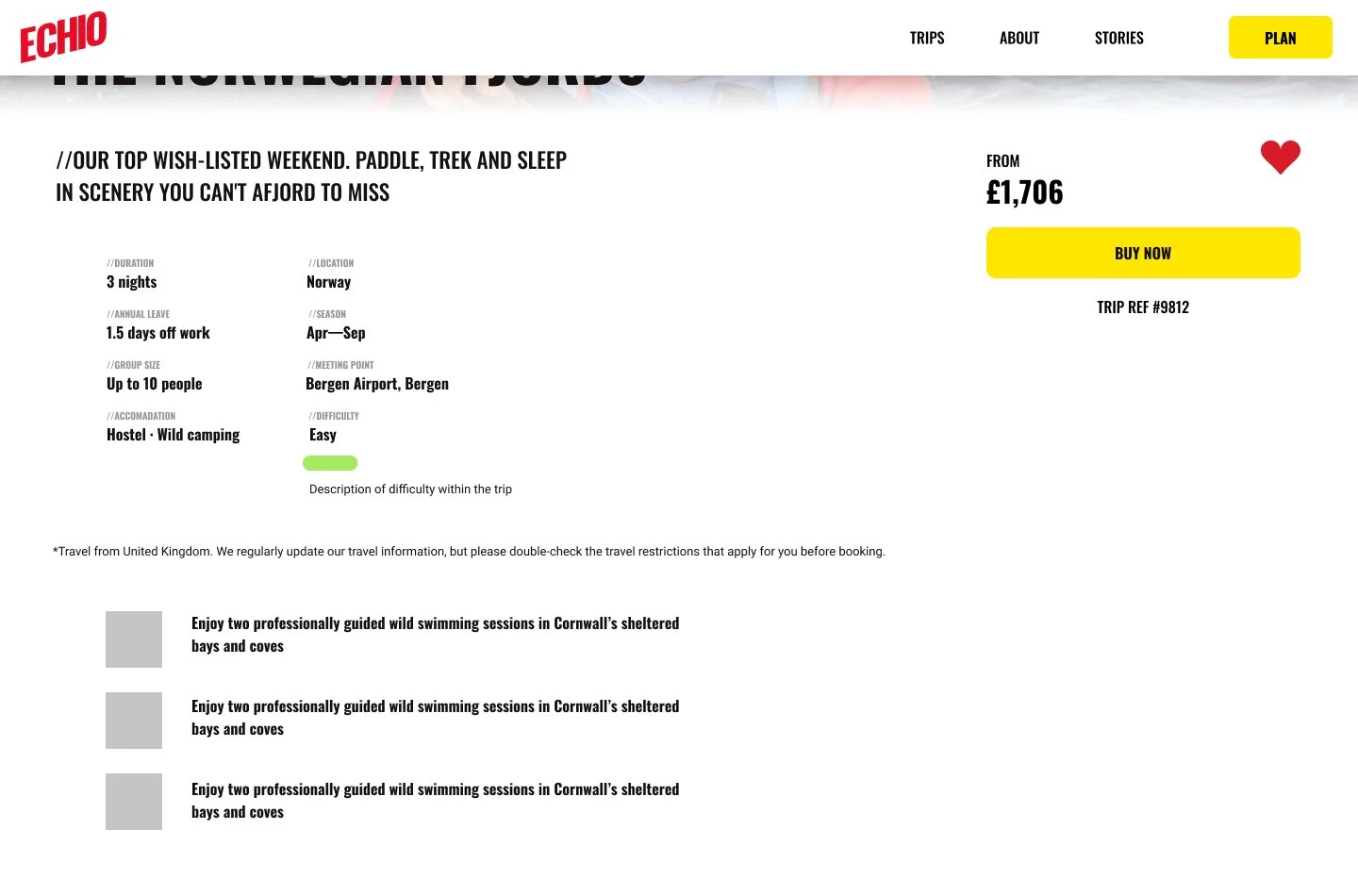
Trip Information